Your website should fit the way people browse.
Responsive design adapts content, images and navigation to the available screen. It is included in every website package.
- Flexible page layouts
- Touch-friendly buttons and menus
- Images sized for each screen
- Checks across common device sizes
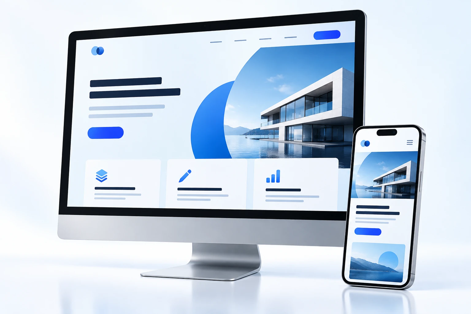
Text and spacing adjust to smaller screens so visitors can read without zooming.
Menus and buttons are designed for both touchscreens and a mouse.
We can discuss how a new responsive layout could improve the experience of using your current site.